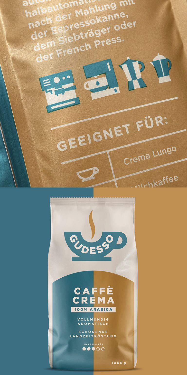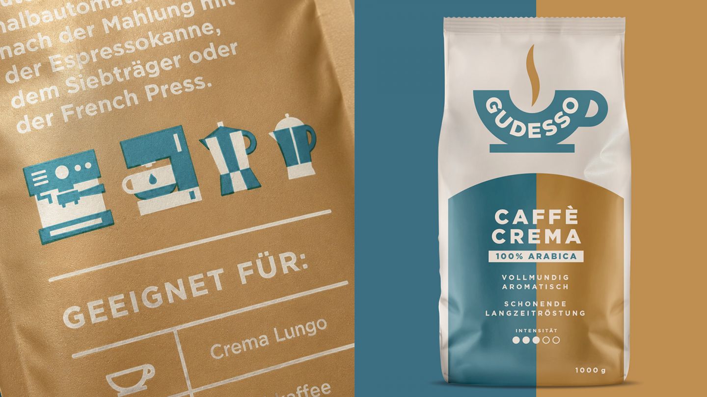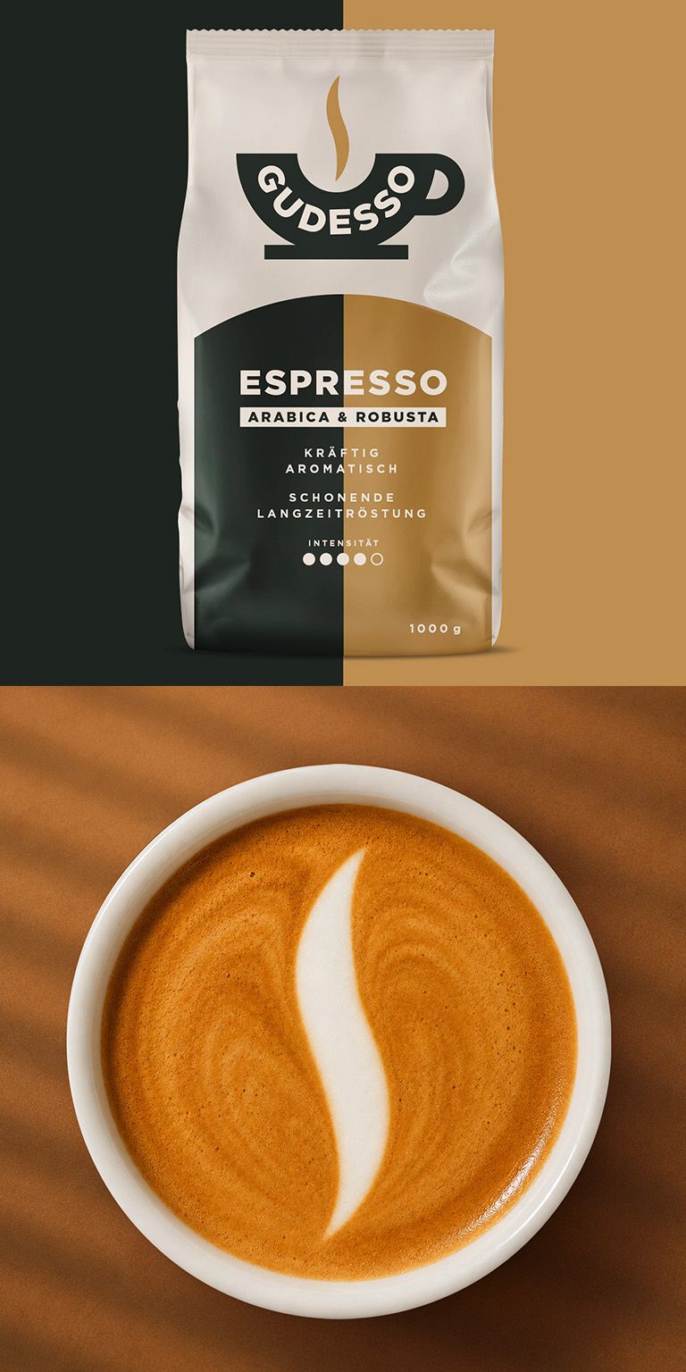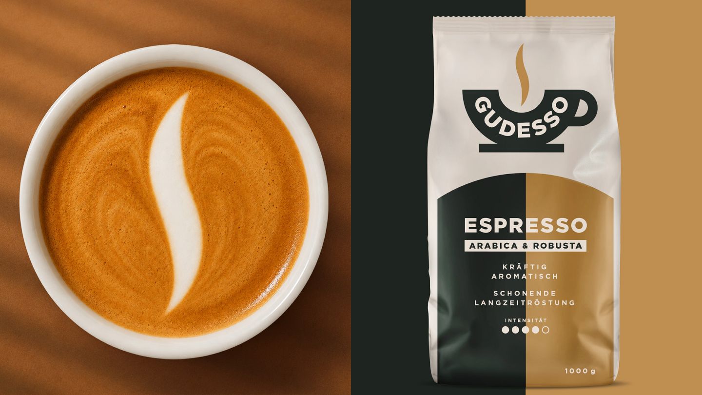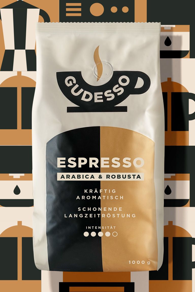
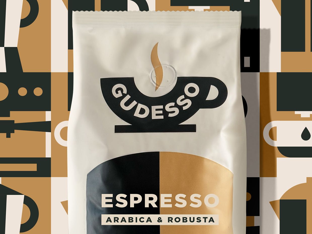
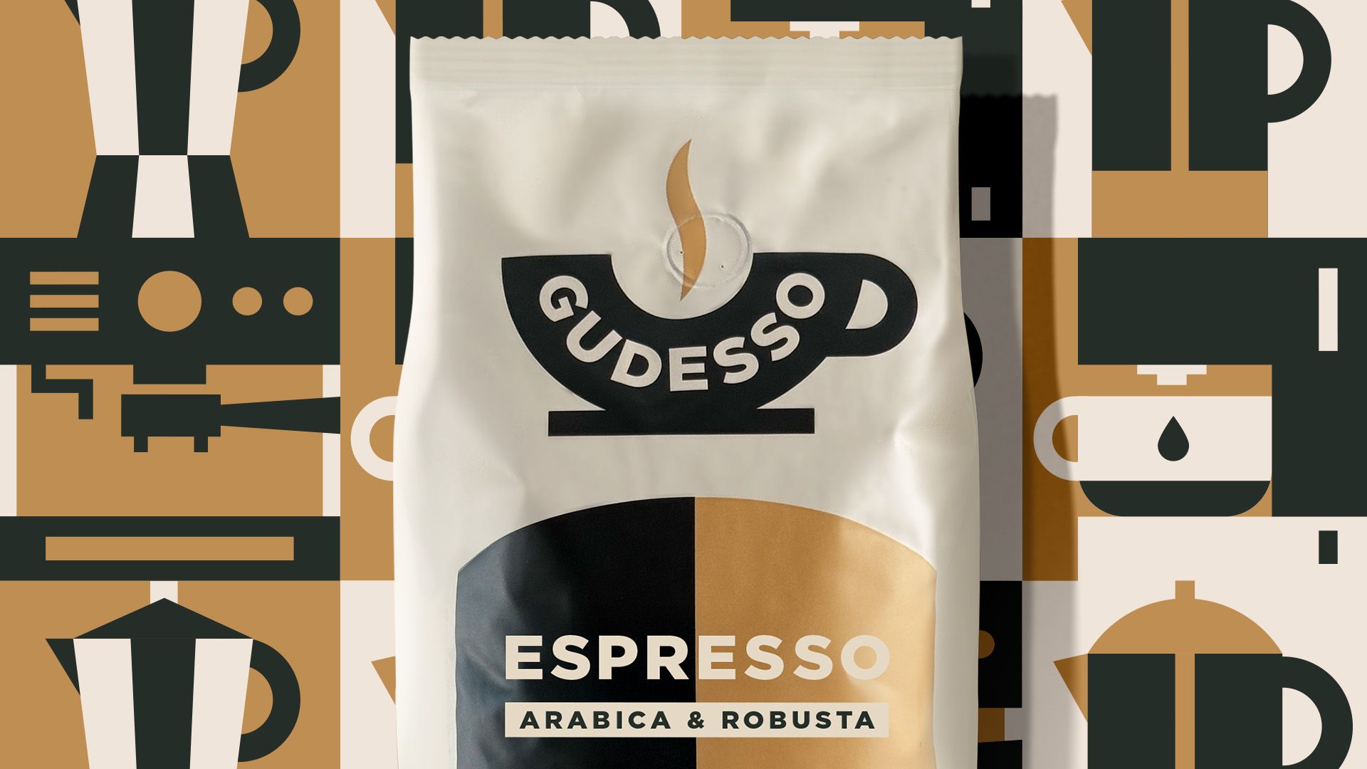
Gudesso has been developed from the ground up to convey that familiar sense of being rooted in Italian coffee culture. The modern retro design lends the new brand a touch of heritage and ensures it makes a strong impact on the digital shelf.
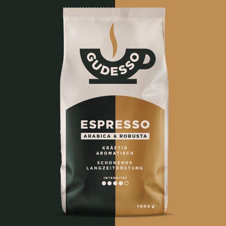
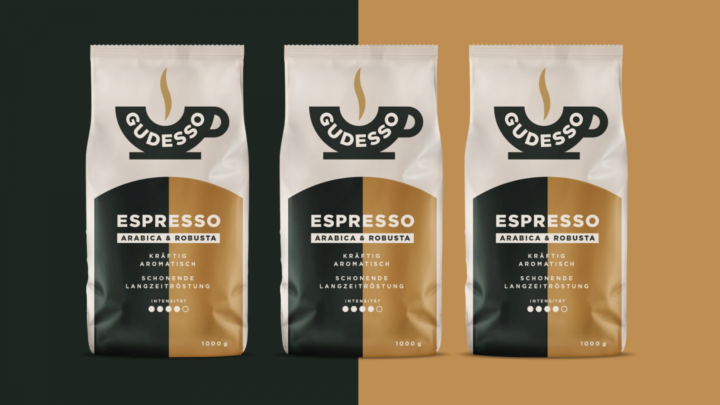
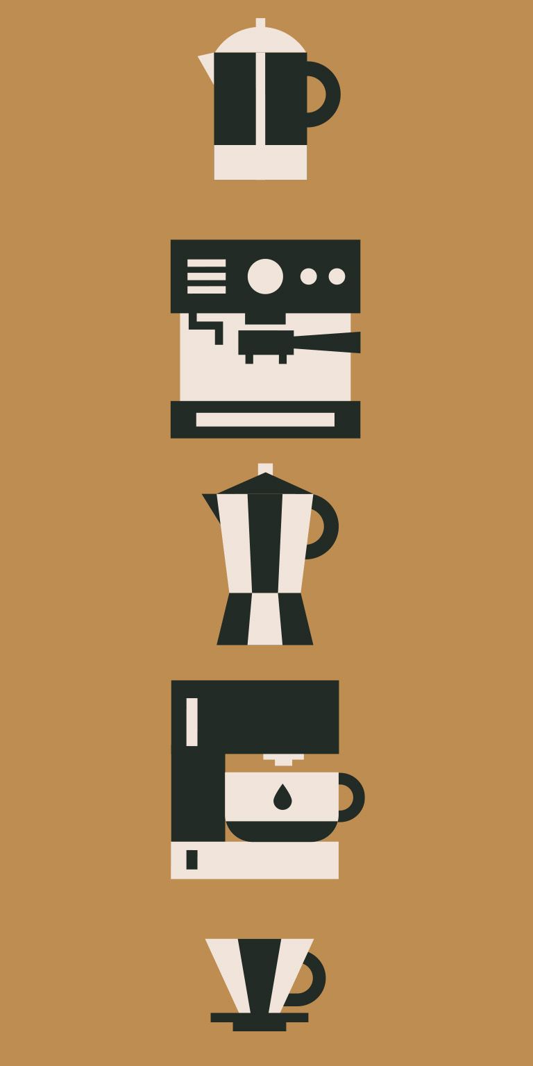
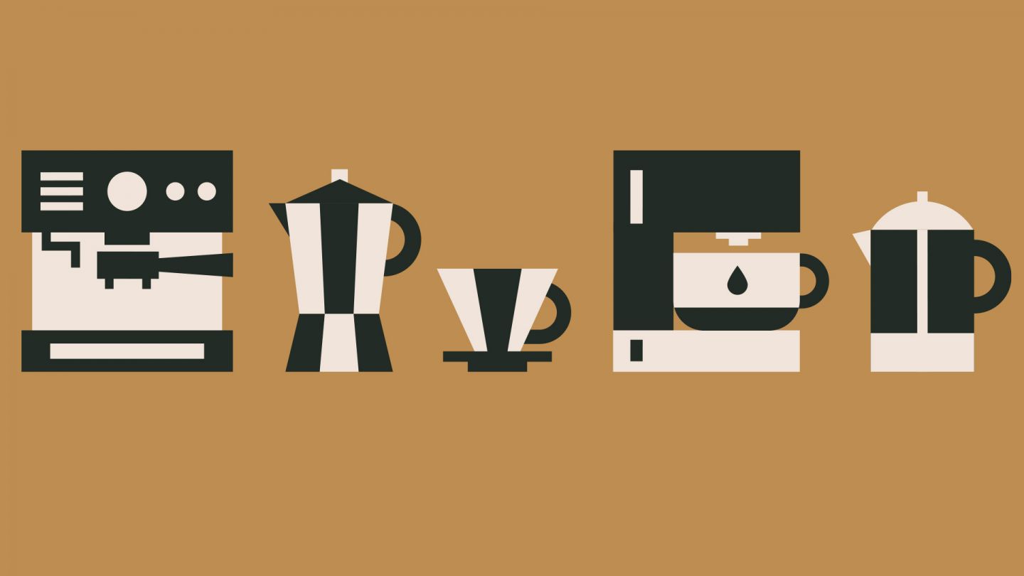
What do you do when a new brand doesn’t yet have any recognisable brand elements or, to use a nice marketing buzzword, any distinctive brand assets? With Gudesso, we had to start from scratch. Everything was new: the name, the logo, the design and the entire brand identity. A private label for an online retailer that was specifically designed not to look like a typical private label. Gudesso was intended to give the impression that the brand had been around for many years, even though its history, name and entire brand identity had been completely reinvented. At the same time, the design had to work on the digital shelf, where products often appear just a few pixels in size on small smartphone screens. This requires a clear and distinctive design that can hold its own against well-known competitors. As Italy is, for many people, the emotional home of coffee enjoyment, we conveyed this feeling through the naming, logo and design. The result is a modern retro look with clear typography, a striking colour scheme and eye-catching icon illustrations. The design creates recognisability, conveys quality and gives the new brand a credible story. You could say we’ve invented a unique heritage for Gudesso: new, yet familiar. Classic enough to convey tradition, and modern enough to work on the digital shelf.
Overview of project
Client: Minges Kaffeerösterei GmbH
Assignment: Branding of a new Beverage Subbrand Design
Core competence: Beer design / beverage packaging
Project components: Design strategy/ Logo Design / Packaging / Logomark / Visual identity