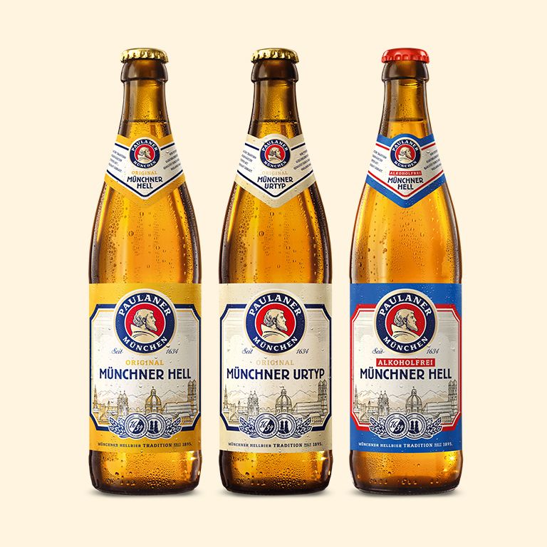


Going back to proceed! The reclaiming of tradition and folklore are widely spread, especially in bavaria. The new „Münchner Hell“ is inspired by elements of historic labels. We carefully used them to put back emotion and history onto the bottle. Still in its iconic colour the label now is bright and fresh.


In times of complexity and uncertainty people seam to revert to well-proven goods and behaviours. Tradition and heritage promise quality. Emotionality surely plays a major role. Therefore we replaced the monochrome silhouette of munics city center with an engraved rich detailed illustration, that is now more recognizable. The curved frame replaces the sti octagon and traditional medals make the impression perfect. As in the entire range the label is dominated by the center trademark, that makes an additional lettering unnecessary.
Overview of project
Client: Paulaner Brewery
Assignment: Relaunch of the Beverage Brand Design
Core competence: Beer design, beverage packaging
Project components: Design strategy/ Logo Design / Packaging / Corporate Design


