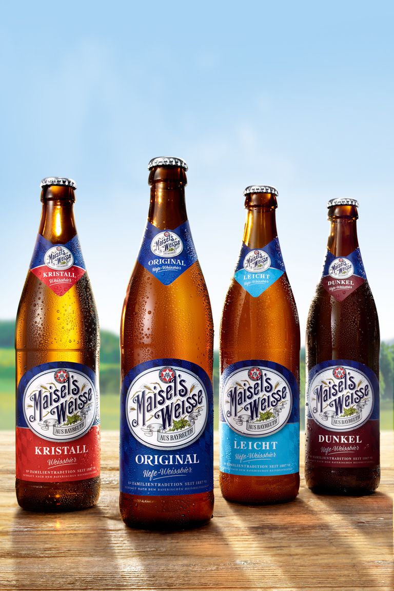


Maisel Design Relaunch - If you really want to capture the Bavarian way of life, there is nothing better than a bottle of wheat beer. And just how refreshing this looks can now be admired on the labels of Maisel's Weisse, which Higgins has redesigned with a great love of detail.


When we were asked to visually recreate the traditional wheat beer brand Maisel's Weisse, there was one thing we felt above all else: huge respect! On the one hand, it was a matter of sensitively portraying the Bayreuth-based Upper Franconian’s passionate art of brewing. On the other hand, it was time to give the hearty, traditional Bavarians a more contemporary, creative impetus.
The result is something to be proud of. With the Packaging Relaunch, we have carefully created an evolutionary presentation that - despite all its modernity, expressive typography and enhanced design elements - retains 100% of the honest and authentic character of the brand.
Overview of project
Client: Brauerei Gebr. Maisel
Assignment: Beverage Packaging for Maisel's Weisse
Core competence: Beer design / beverage packaging / naming development
Project components:Label design / packaging design / illustration / POS presence / naming development


