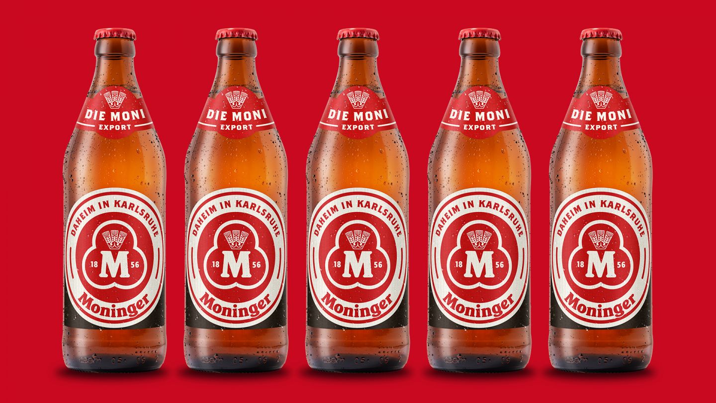


Above the rooftops of Karlsruhe, the Moninger sign turns anew again. Nothing was reinvented, but told in a new way with plenty of spirit.


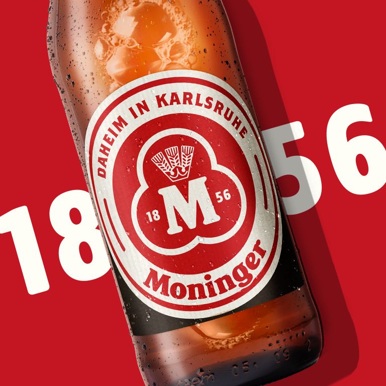
For the rebranding of the Moninger brand, which has been established in Karlsruhe since 1856, our goal was to make the brand appear less classic and traditional, but authentic, approachable and contemporary. The new design pays homage to the brand's heritage, which is confident and simple. We took inspiration from the best pieces we found in Moninger's archives from the brand's long history. Every element was redesigned, from the typography to the famous 3-circle logo, and brought to life in a very dynamic brand architecture. One trend that has come to stay is the New Retro trend. Going back to the heritage of a brand and reinterpreting it fits our times.
Overview of project
Client: Brauerei Moninger
Assignment: Relaunch of the Beverage Brand Design
Core competence: Beer design, beverage packaging, 3D design
Project components: Design strategy/ Logo Design / Packaging
Fotos Alisia Sina Wagner


